
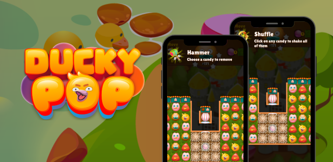
The Best Power-Ups and Boosters in Ducky Pop: When and How to Use Them
24 Sep, 2024
- 14194 views


2016 - 2026 Copyright @ Graphie.
All Rights Reserved
Recent Projects and Selected Works
Graphie designed the Padel n’ Play logo with a modern and memorable visual concept to strengthen the brand identity in the padel sports industry. The logo uses a combination of red, black, and white colors to represent energy, passion, professionalism, and a sporty modern image.
Padel n’ Play is a brand that focuses on padel sports and recreational activities. The use of the ball element and the symbol resembling the letter “P” represents the identity of padel while creating a unique and dynamic visual appearance. The bold and rounded typography gives a friendly, active, and easily recognizable impression for the target audience.
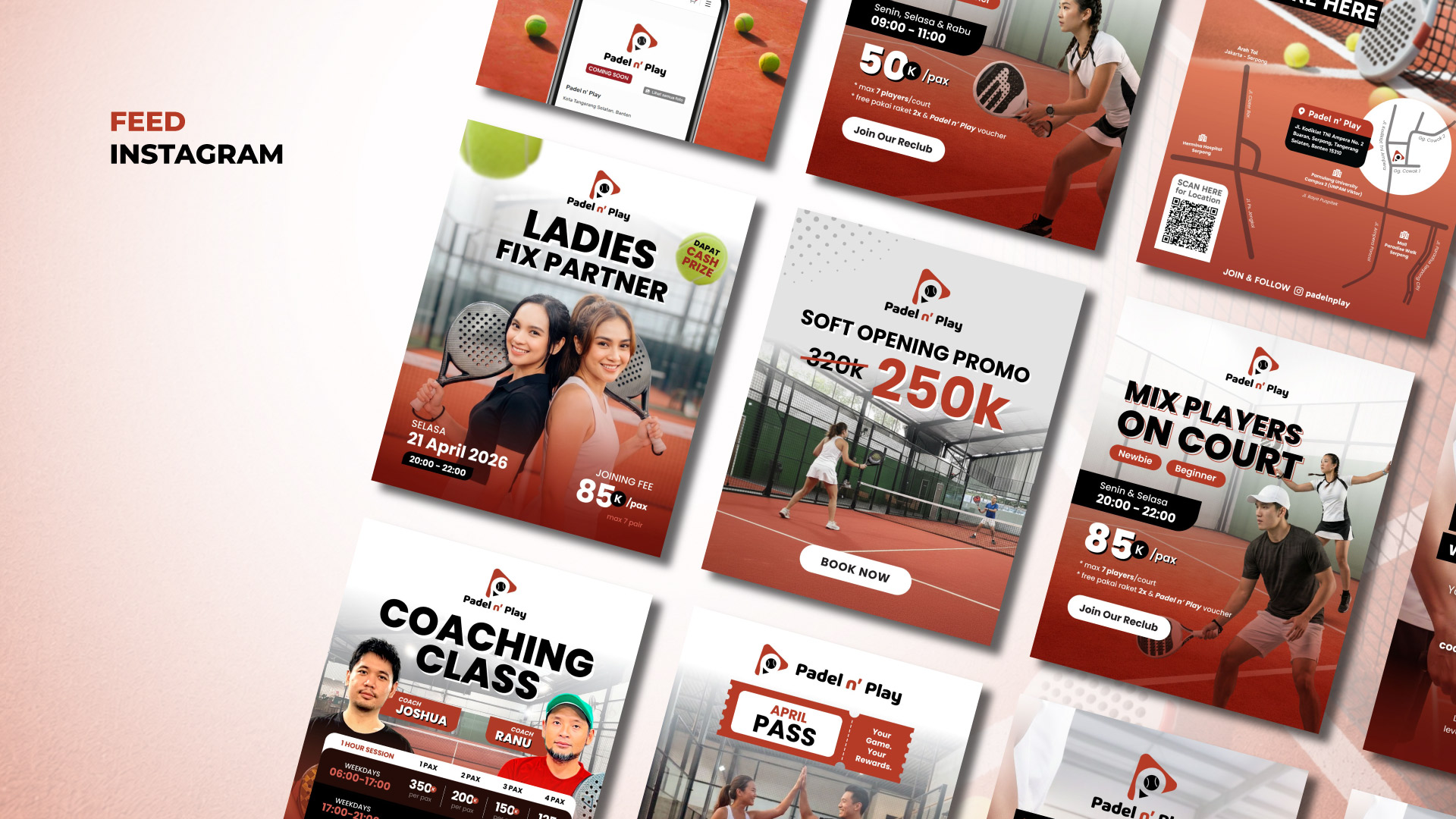
Graphie also created Instagram feed designs with visually engaging and consistent layouts to strengthen brand identity and improve audience engagement on social media platforms.



Recommended for you
The Best Power-Ups and Boosters in Ducky Pop: When and How to Use Them
The Hydrogen Fuel Frontier: Aryanto Misel's Nikuba Tech Shakes the World
The Psychology Behind Match-3 Games: Why Ducky Pop is So Addictive
Feeding the Future: Tackling Global Food Security with AI Agriculture
Ducky Pop: A Splash in the Match-3 Pool
From Idea to Launch: A Step-by-Step Guide to Building Your Dream Startup
The Digital Revolution: How Mobile Apps Have Transformed Our Daily Lives
Tonework: The Future of Personalized Beauty is Here
Unlock the Hidden Worlds: Exploring the Different Themes and Levels in Ducky Pop
Typography Tips That Wow: How to Use Fonts Like a Pro
Ducky Pop: A Splash in the Match-3 Pool
The Future of Website Design: AI-Driven Tools Transforming User Experience
UI vs. UX: Cracking the Code of Digital Magic
Revolutionizing Music Creation: An In-Depth Analysis of Meta's MusicGen
The Power of Data Analytics: How to Drive Growth with Informed Decisions